上师大青浦实验小学
当刚交付的崭新校园遇上 “看见、点燃、成就每个孩子” 的教育初心,如何让冷峻的建筑空间生长出童趣与温度,成为LINEWORKS 团队为上师大青浦实验小学暑期改造的核心命题。近日,由我方团队精心打造的校园改造工程已全面竣工,从logo、IP 到空间场景,一场兼顾国际化视野与成长关怀的校园升级正式完成。
When a newly delivered campus meets the educational mission of “Seeing, Inspiring, and Empowering Every Child”, the core challenge for the LINEWORKS team is how to infuse a cold architectural space with childlike charm and warmth. Recently, the Shanghai Normal University Qingpu Experimental Primary School renovation project meticulously crafted by our team has been fully completed. From logo and IP to spatial scenes, a campus upgrade that balances an international perspective with care for children’s growth has officially come to fruition.
作为一所新建学校,校方的交付建筑虽基础完备,却存在着显著的空间适配性问题:低年级学生面对冷峻环境易生疏离感,缺乏少儿适配的温暖氛围;同时,作为以英语、科技、艺术为办学特色的学校,原有空间未能体现创造力特质与国际化底蕴,更缺少文化载体。经过团队和校方深入沟通,把握 “童趣营造”,“特色彰显”,“文化落地” 三大核心需求,成为本次设计的出发点。
As a newly built school, although the delivered buildings are fully equipped with basic facilities, they have obvious spatial adaptability issues: younger students who have just transitioned from kindergarten tend to feel alienated in the cold environment, and the space lacks a warm atmosphere suitable for children. Meanwhile, as a school featuring English, technology, and art, the original space failed to reflect the characteristics of creativity and internationality, and was even short of cultural carriers. After in-depth communication between our team and the school, identifying the three core needs “creating childlike charm”, “highlighting characteristics”, and “materializing culture”—became the starting point of this design.

logo 设计成为诠释学校精神的第一道密码。我们深度融合 “看见、点燃、成就每个孩子” 的办学理念,提取 “青浦” 拼音首字母 “QP” 为隐形骨架,融入 “成长的小苗” 与 “国际性对话交流” 两大元素。简约的图案既是幼苗向上生长的姿态,亦是文化的桥梁,流露出教育的温度与国际视野。
The logo design serves as the first key to interpreting the school’s spirit. We deeply integrated the school’s educational philosophy of “Seeing, Inspiring, and Empowering Every Child”, took the initials “QP” of “Qingpu” (in Pinyin) as the invisible framework, and incorporated two core elements: “growing seedlings” and “international dialogue and communication”. The simple pattern not only represents the upward growth of seedlings but also symbolizes a bridge of culture, embodying the warmth of education and an international perspective.
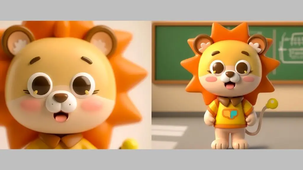
而吉祥物 “阳阳”则为学校注入了更生动的情感连接。以象征温暖与力量的小狮子为原型,“阳阳” 被赋予 “照亮幼苗的光束” 这一内涵,如同太阳般陪伴孩子们成长的形象,呼应了 “点燃成长” 的理念。
The mascot “Yangyang” has brought a more vivid emotional connection to the school. With a little lion (a symbol of warmth and strength) as its prototype, “Yangyang” is endowed with the connotation of “a beam of light illuminating the seedlings”. Its image of accompanying children’s growth like the sun echoes the concept of “inspiring growth”.
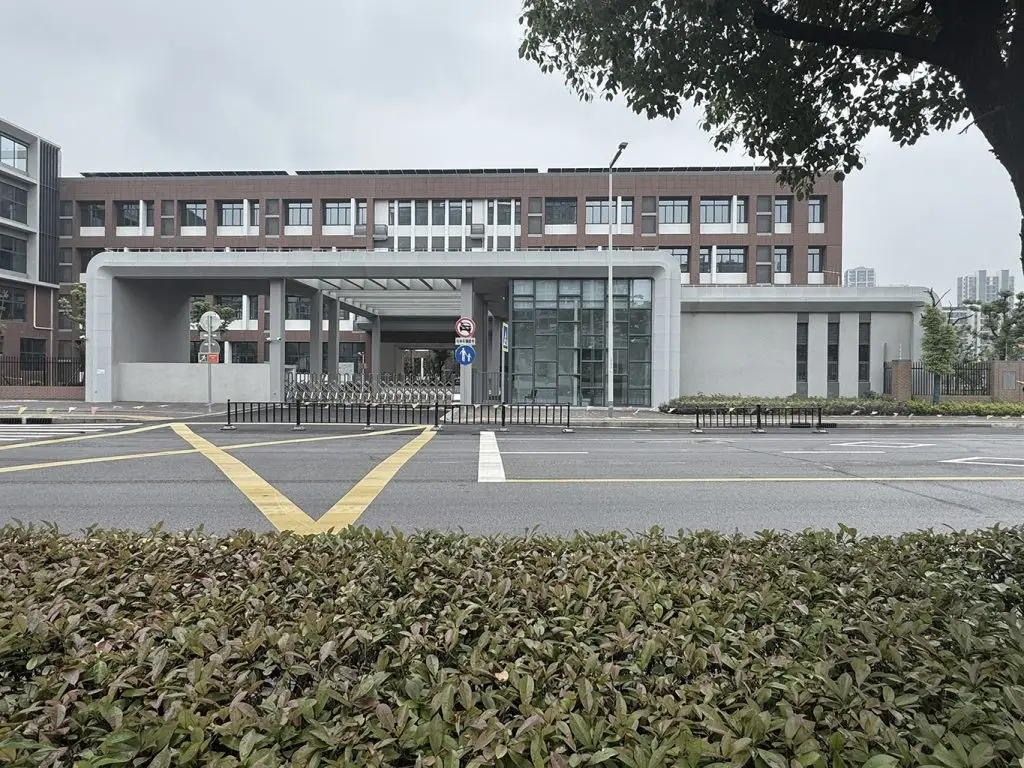
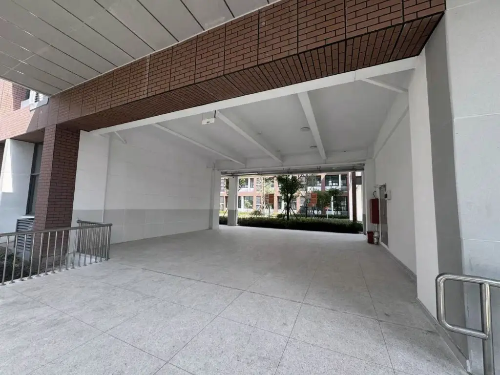
改造前 \ Before

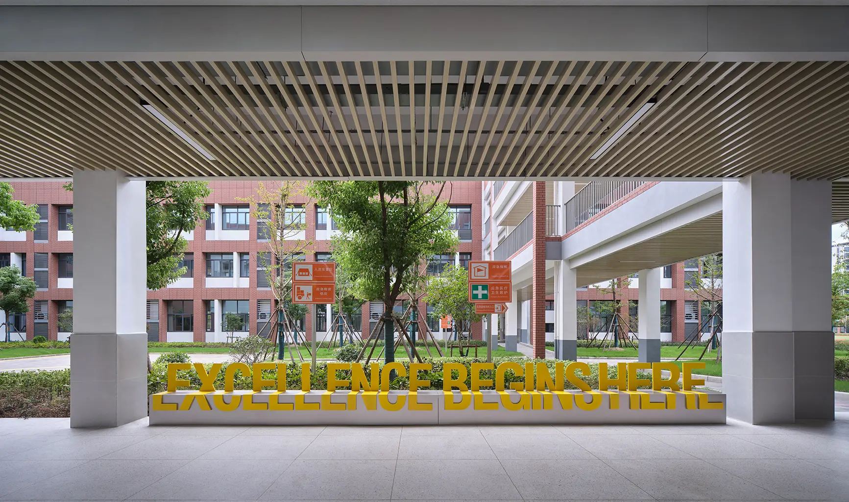
在入口处,设计团队通过搭配丰富而有序的图案,打造出承载校训精神的系列旗帜。当师生步入校园,温暖的色彩与鲜明的文化符号瞬间消解了建筑的冷峻感,构建出仪式感与归属感。
At the entrance, the design team created a series of flags carrying the spirit of the school motto by matching rich and well-arranged patterns. When teachers and students enter the campus, the warm colors and distinctive cultural symbols instantly dispel the coldness of the building, creating a sense of ritual and belonging.
改造前 \ Before


改造前 \ Before
校园大厅方面,我们首先以延续上师大的主题色为基础,调配出更显青春活力的专属绿色。同时,我们顺应原有建筑梁架结构,采用斜顶天花设计,让空间更显通透、活力。最后,针对校园大厅的文化展示需求,设计团队用 “分侧设计、双向呈现” 的思路做了细节规划:一侧陈列学生作品,另一侧展现校风校训,以实现文化与创意的直观呈现。
For the hall, we first took the continuation of Shanghai Normal University’s theme color as the foundation and developed an exclusive green color that exudes more youthful vitality. At the same time, we adapted to the original structural beams of the building and adopted a sloped ceiling design, making the space more transparent and vibrant. Finally, to meet the cultural display needs of the campus hall, the design team made detailed plans based on the concept of “left-right design and two-way presentation”: one side displays students’ works, while the other side showcases the school spirit and motto, thereby realizing the intuitive presentation of culture and creativity.

改造前 \ Before

行政大厅空间以温润的木纹材质为主基调,中和了现有空间的疏离感。天花采用木纹格栅搭配长短不一的条形灯组合设计,既在视觉上营造出层次分明的现代美感,又有效降低了空间回音,提升了交流舒适度。入口一侧的荣誉展柜陈列了校园的成长印记,绿色背板成为视觉焦点,将科技感与人文气息巧妙融合;另一侧的磁吸板则实时更新校园的文化活动,让行政空间也充满了鲜活的校园生命力。
The administrative hall is dominated by warm wood-grain materials, which alleviate the sense of alienation in the existing space. The ceiling adopts a combination design of wood-grain grilles and strip lights of different lengths. This not only creates a layered and modern aesthetic visually but also effectively reduces echo in the space and improves communication comfort. The honor cabinet on one side of the entrance displays the school’s growth milestones, and the green background board becomes the visual focus, skillfully integrating a sense of technology with humanistic atmosphere. The magnetic board on the other side updates the school’s cultural activities in real time, filling the administrative space with vivid campus vitality.

从品牌符号的提炼到空间场景的营造,本次改造设计始终围绕 “以孩子为中心” 的核心逻辑。未来,这里将成为孩子们探索世界、绽放自我的乐园,我们也有幸以设计为桥,见证每一颗 “幼苗” 在阳光般的校园氛围中茁壮成长。
From the refinement of brand symbols to the creation of spatial scenarios, this renovation design has always centered on the core logic of “child-centered”. In the future, this place will become a paradise for children to explore the world and showcase themselves, and we are honored to witness every “seedling” thrive in this sun-like campus atmosphere, with our design serving as a bridge.
概况:
COMPLETED: 2025 September
CLIENT: SHNU Qingpu Experimental Primary School
LOCATION: Shanghai
SIZE: 180 sqm
TEAM: Mike Chen,Ciya Qin,Lucky Lu
PHOTOGRAPHER: SHA PENG